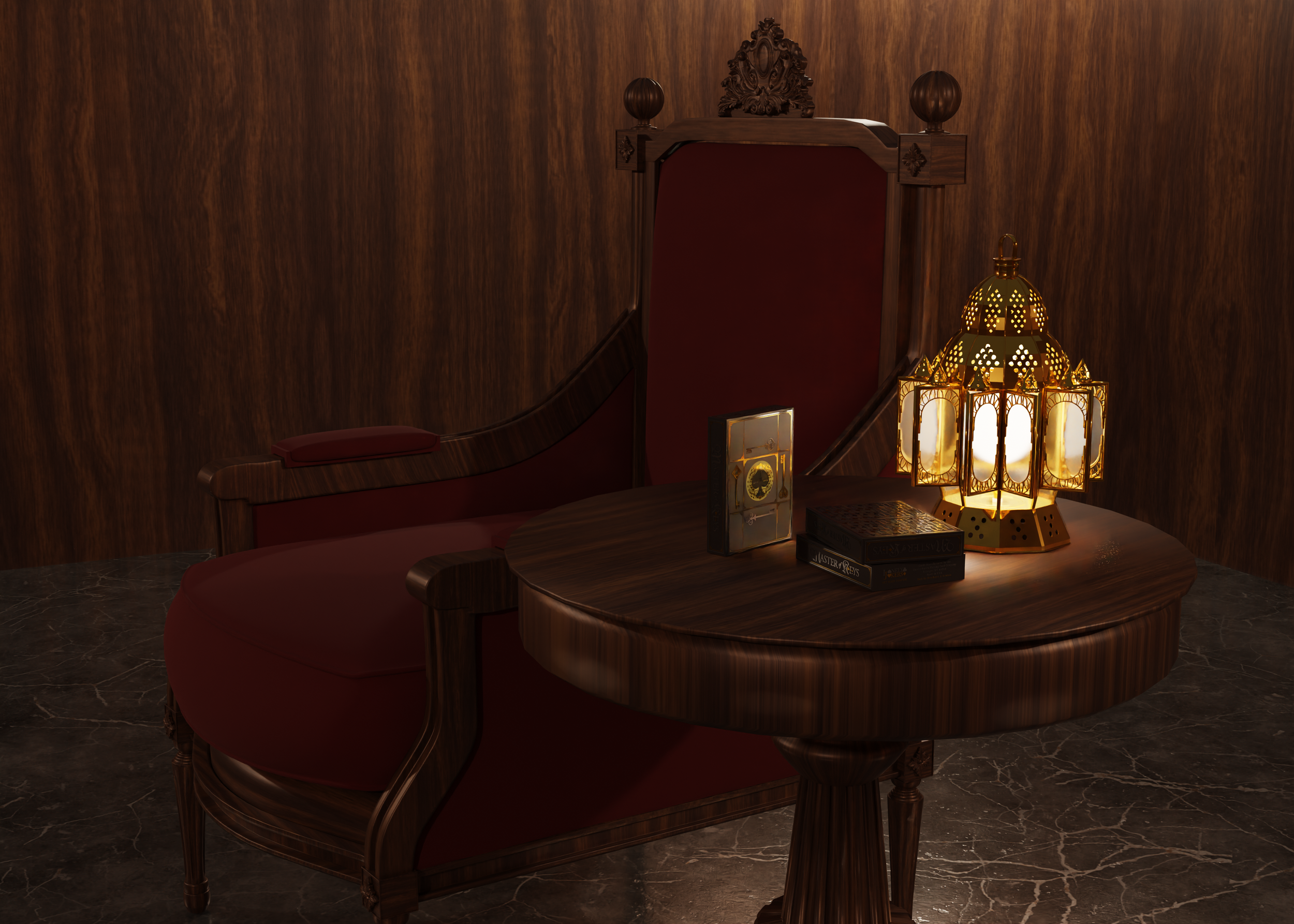
I needed a foundational story for the Royal Guard Playing Card series, and as I began playing with the idea of a complex labyrinth built into a fifty-two card deck, a new tale began to unfold — The Master of Keys.
The manner in which the tale unfolded for me was through a variety of creative free-writing experiences, along with a couple of extremely realistic dreams of wandering through a darkened castle with a torch in hand and the internal knowledge that I had to hurry to solve the maze of corridors or something terrible would happen.
When the tale was completed, as you can read below, a very distinct set of characters evolved with an important task set before them. The challenge then became a task of aligning the story to a deck of playing cards so that the “player” could follow the clues and solve the puzzle for themselves, just as the main characters from the story have set out to do.
The Setting
The entirety of the tale of the Master of Keys is set within a castle of ages long ago. The challenge of the puzzle within the deck splits the castle into four segments — the Royal Apartments & Throne Room (the Spades), the Castle Treasury (the Diamonds), the Armory & Dungeons (the Clubs), and the Royal Gardens & Grounds (the Hearts).
Within these four segments of the castle, a total of 52 doors or portraits have been customized by the Master of Keys which, when opened in the correct order, will lead the player to a secret chamber which holds a prize of great consequence. With this in mind, I created all of the cards in the deck to resemble doors or portraits that might be found in a castle of antiquity (with just enough fantasy & mystery to be believable).
The Suits
The four divisions of the Castle are represented below, along with the current design of the number and court cards — the actual labyrinth aspect of the deck is described in detail within the tale, so the keys, locks, and corresponding numbers will make sense to the player before they begin their search.
Deck Backs
I wanted the deck backs to have a strong amount of detail, but not so much that it drew the eye away from the important features of the card fronts — they have to look different enough that they can be separated if the cards get jumbled, but still match the overall feel that they seem fitting.
I also wanted to present something that offered a good fan for cardists and deck display in formal gatherings, and therefore kept to a clean and orderly design pattern.
The Tuck
I absolutely love the highly intricate design of modern tucks when combined with embossing and foil-stamping, but the more that I thought about the themes behind the tale of this deck, the less I wanted to “busy up” the tuck with unnecessary imagery or iconography. The story is about keys and locks, and so I’ve focused predominantly on those elements for the current design of the tuck.
The plan is to have the tuck printed with Boschiero & Newton (of Italy) on heavy brown matte stock with embossing and both gold and silver foil-stamping (see the sample rendered concept images below).
Full Tuck Imagery
Here is a 360˚ animation of the rendered design to give an idea of the overall look and feel of the tuck.
The Extras
For the initial Kickstarter campaign, I plan on offering a number of accessory items with the deck of cards. These include plans for the following:
A Booklet of the Tale of the Master of Keys (3”x5”, 28-page booklet)
Collectible Coins
Custom Keys (hand-crafted versions of the keys within the deck), individuals or a set of four
Uncut Sheets
Stickers

The Master of Keys Tale
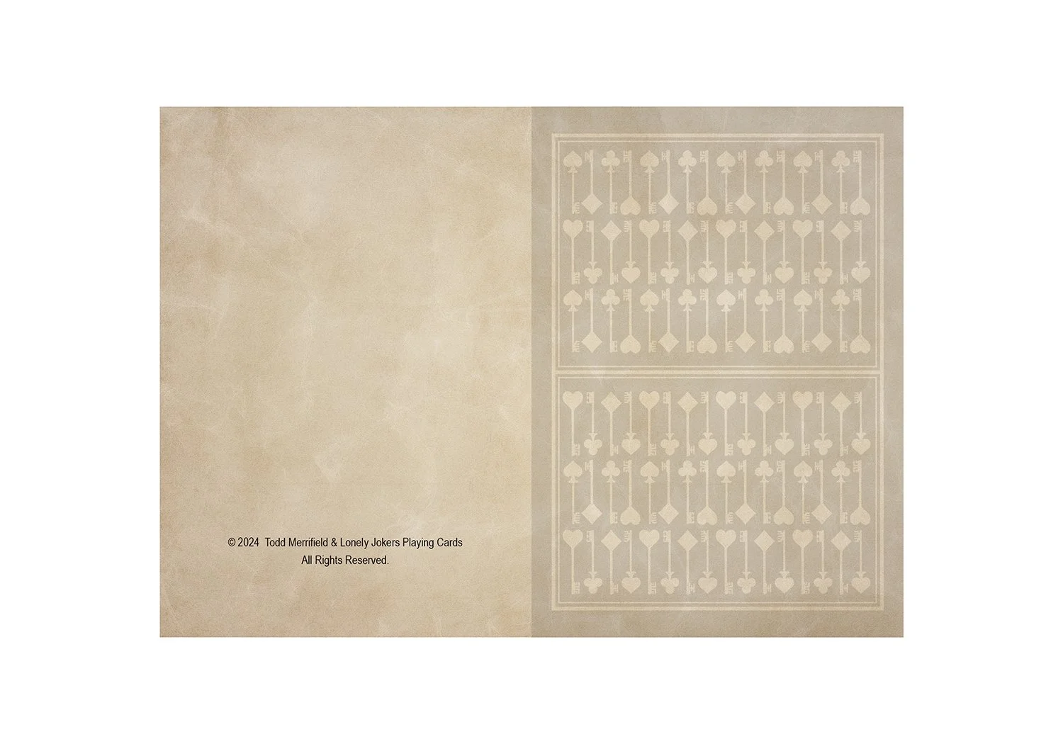
The images below represent the layout for the 3.5” x 5” Booklet that I hope to produce for the upcoming Kickstarter campaign.


