Lonely Jokers
Studio Signature Deck
After seeing my first two decks fail to fund, I began to study all of the factors that may have gone into the campaigns not achieving success. Highest among the issues continues to be the slow growth of a strong follower base, and this, I know, comes only with time and great effort/consistency in marketing. Beyond that, though, the largest complaint that I heard from some playing card enthusiasts was the lack of standard pips and courts, and the use of 3D imagery instead of the typical flat, 2D line art that is usually employed in playing cards. As this was largely by design — I’m not one who enjoys staying strictly to the patterns of any design trends — I have to accept the “cool welcome” of my designs with a bit of humility and understanding.
So, in an effort to focus on establishing a strong foundation for my studio (and the future 3D and creative designs I want to do), I decided to work on a more traditional (albeit still filled with path-straying features) deck of playing cards. This deck showcases the heroes and influencers who guided my own artistic goofiness, the lonely jokers about whom I named my design studio — the vaudeville and carnival and circus performers who worked (many times alone on stage) to bring joy and wonder to their audiences. I have chosen to work in 2D line art, with simplistic pips. The back design is slightly complex, though only in aesthetics, and should do well for cardists and players who enjoy a great fan.
With that, I introduce the Lonely Jokers Signature Deck of premium playing cards!

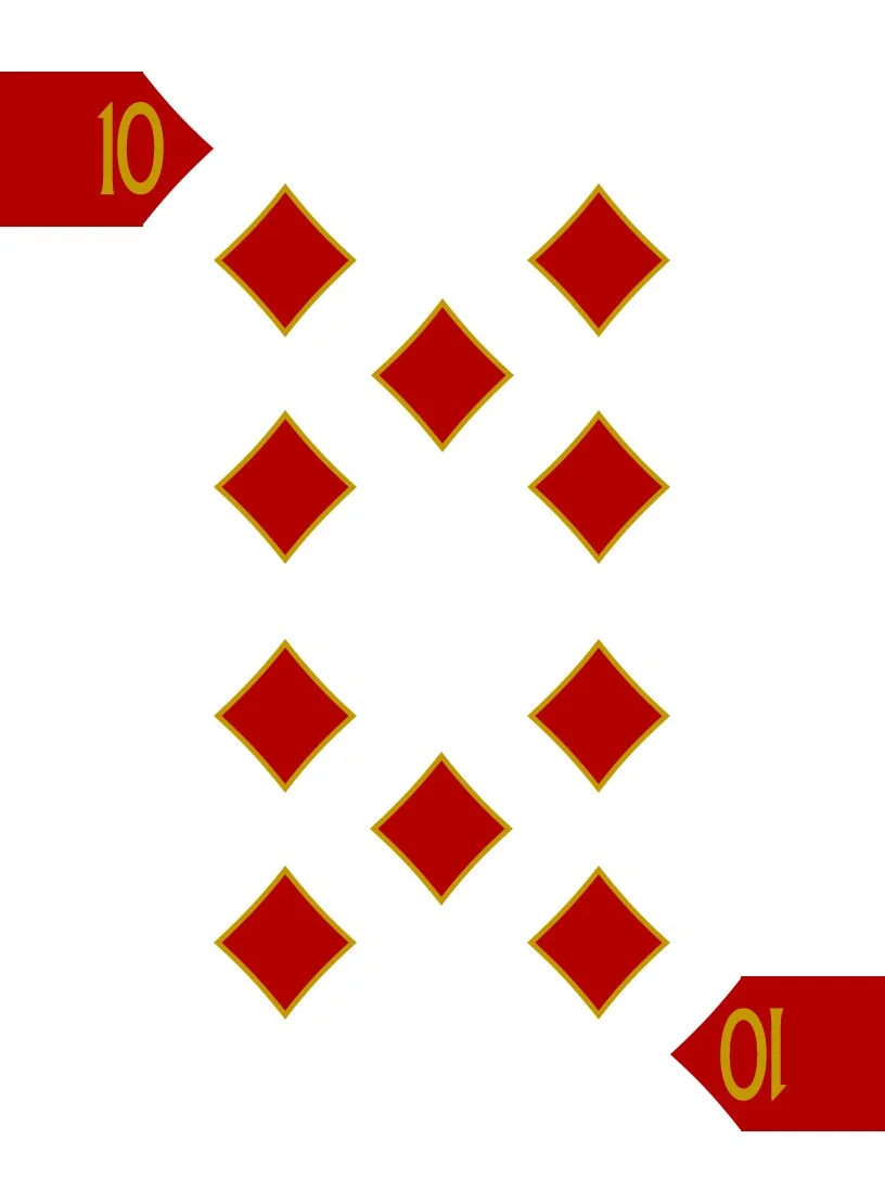
Because I had designed a custom set of pips for the studio logo, I decided to use those pips on this deck and began the process of laying out each of the suits and number cards to establish the look and feel of the deck. The biggest change that I wanted to attempt in this area was in the design of the index areas — rather than including the typical number and small pip for each suit in the upper left/lower right, I wanted to design a full-bleed mark that would be consistent on all cards, but that would still indicate the suit by design/color, while incorporating the number of the card within.
The printing goal is to incorporate metallic inks throughout the deck — silver will be paired with black, and gold with the red. Wherever you see these colors in the examples on this page, understand that they will be printed in metallic inks.
Most of the fun of developing this deck was in the selection of the lonely jokers I wanted to showcase! There were several that I knew I wanted to include from the beginning, but coming up with twelve for a full court was a little more daunting. Fortunately, I was able to isolate the perfect grouping of characters and found great collateral imagery to use as my inspiration.
I started with the Diamonds, and launched into my reacquaintance with Adobe Illustrator, creating the Sword Swallower, the Fortune Teller, and the Dancer.


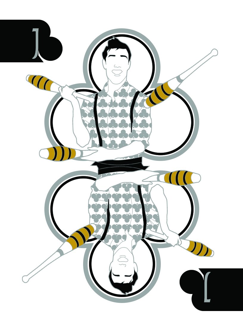
Next came the Clubs, and the creation of the Juggler, the Acrobat, and the Clown.


Hearts came third, and the creation of the One Man Band, the Fire Eater, and the Mime.


And finally came the Spades — the Knife Thrower, the Trapeze Artist, and the Magician.


I wanted the back of the cards to employ a design that would look really powerful when fanned, and employed the same pips in a fashion that created movement and framing for the deck.
The semi-spiral pattern establishes movement before the fan is even opened by the card handler. The Diamonds extending off the edge of the card (as a full bleed) help to create more complexity when the deck is fanned or spread on a surface.

I had originally planned on having very simplistic Aces for the Diamonds, Clubs, and Hearts, as is typical — designing a much more complex and ornate Ace for the Spade, but when I considered incorporating the name of the deck into the design, I decided to take a much different approach. In this way, each of the Aces gets equal representation and embellishment, while at the same time remaining somewhat simplistic in design. I know that I’m breaking with tradition (Again!), but I love the look of this quartet!
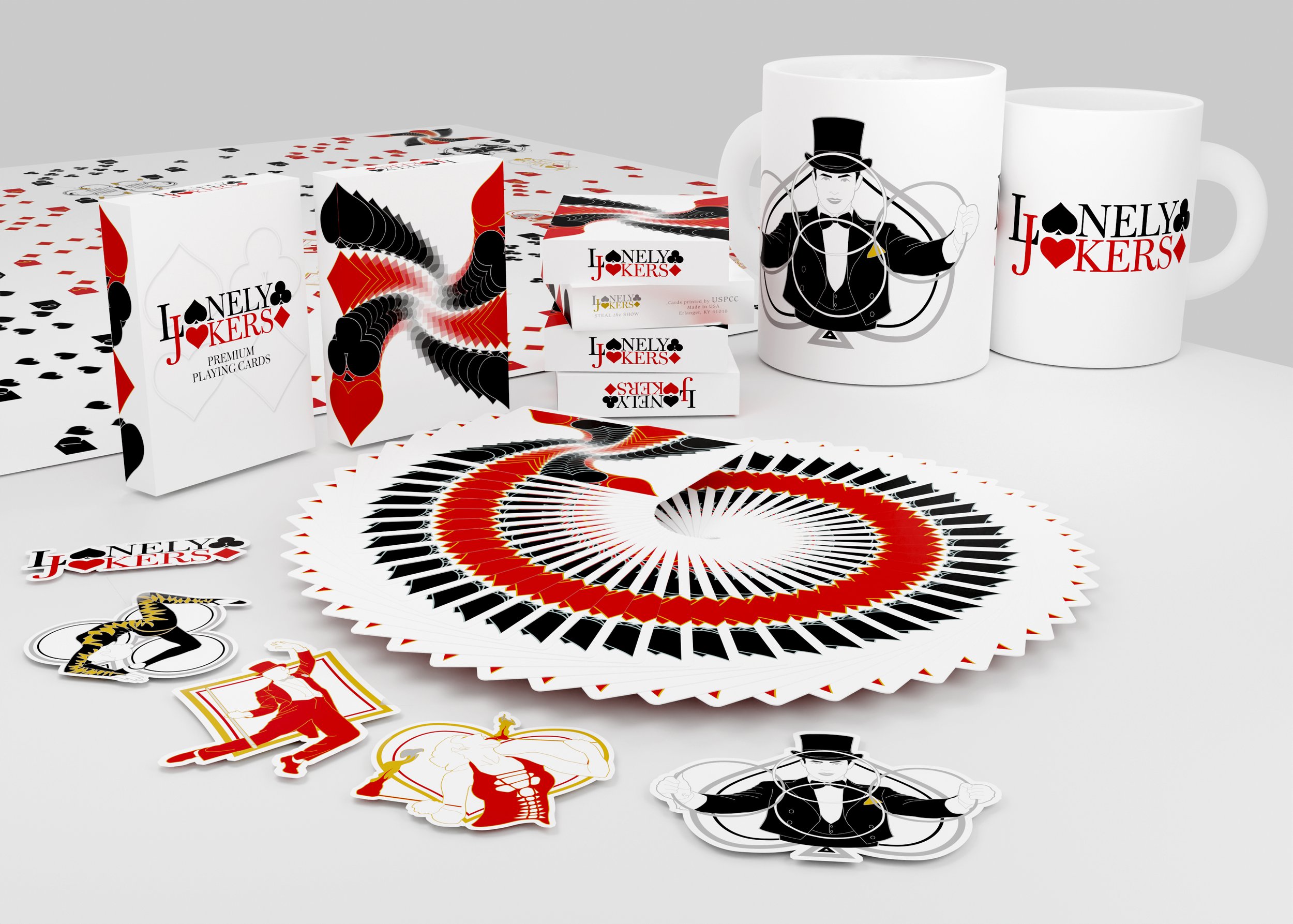
The standard tuck for the deck is based on the back design and a modulation of the Ace design. If the future campaign for this deck reaches a stretch goal for a fancy tuck, then embossing and foil-stamping may be included to accentuate specific features (or involve a new design altogether).
The flat standard tuck, as it would be printed by USPCC.

For the accessories of the signature deck, we’re looking at producing a set of stickers (5 in total), uncut sheets, and coffee mugs (from a selection of the Magician, The Fire Eater, the Dancer, and the Acrobat).
